 Skip to content
Semiotic foundations for pack development
By Duncan Smith

Semiotic analysis decodes the implicit cultural narrative that drives a pack’s success, according to William Landell Mills founder of qual & semiotics agency, Amaranth Insight. In this article he uses BrewDog to illustrate how to identify a core narrative, so that it can be amplified in future pack development.
Design styles express underlying cultural impulses
Semiotics is based on the idea that cultural meaning (for example the ‘romantic appeal of nature’) doesn’t come from within individuals, but rather that individuals are born into societies which contain structures of meaning, that people grow up with and then use to interpret the world around them. These ‘meanings’ are functions of underlying sociological forces (for example, it was the separation from nature in urban societies, which generated the romantic idealisation of nature). Product categories and brands grow when they meet a cultural need, born of a sociological reality.
Successful designs contain an extraordinary intuition that connects a product to a cultural need, through aesthetic styling. When modernising an already established pack by incorporating more contemporary cues, semiotics can help identify the fundamental tensions that make a pack unique and define its narrative, so that the brand retains its identity as it is modernised.
It is extremely important when starting off on a journey to increase the cultural relevance of an existing pack, that you are very clear about the following:
- The major cultural tensions playing out in your category
- How your pack channels these forces to achieve its success
- How those forces are evolving in the category
- Therefore, how the brand can align its DNA to the wider forces emerging in the category without eroding its underlying identity
The greatest value from semiotics comes when it is conducted at the start of a development programme as it maps the cultural landscape the pack operates in, and what its implicit narrative is.
Decoding BrewDog in the craft beer landscape
To understand the meaning of a pack you must understand the cultural landscape it operates in. We would typically analyse a product category (craft beer for example) by analysing the packs and ads of twenty leading brands. We identify the different aesthetic styles on display, as each style represents a different cultural need. Cultural forms take shape in tension to each other (as black creates white, up creates down and 70s pop kitsch created punk vitriol). Systematic decoding reveals the fundamental tensions that shape the category map. Individual brands can then be plotted on the map.
The example below is taken from a study of craft beer. The way to read the map is to understand that the green box is in radical opposition to the pink box, and that the yellow is in radical opposition to the blue. The words on the edges of the box are opposites to the ones on the other side of the square and characterise the two boxes they are adjacent to.
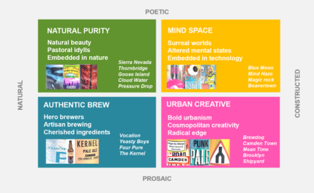
Crucially, while any given brand will have a centre of gravity, it will also often express codes from an adjacent territory. This means that there are tensions within the brand itself. This is not a problem. In fact, this tension is what creates a brand’s unique character.
Take BrewDog as an example. BrewDog’s immediate impact/feel is challenging. Its raw attitude very much conforms to the edgy (pink) Urban Creative space. But, with closer inspection, we quickly see it also has the earnest artisanal characteristics of the (blue) Authentic Brew space (albeit without the latter’s piety). It is this tension between the punk urban spirit, versus the personal commitment to artisanal brewing, which gives the brand character its unique tang. Indeed, when you realise that this tension is at work, you can even hear it in the name: ‘Brew’ expresses the blue Authentic Brew space, while ‘Dog’ expresses the pink Urban Creative one. The core duality is in the name itself.
This then takes us to the packaging. The graphic below illustrates Urban Creative codes manifested in packs in the pink space (note the absence of naturalism, which belongs in the opposite top left green box we called ‘Natural Purity’: there’s none of that here).
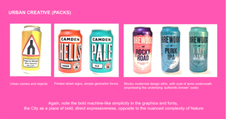
Looking closely at the BrewDog packs, you can see here how they combine a modern urban aesthetic in the colouring, font and tone of voice, but with ‘authenticity’ cued by a coat of arms, ‘buried’ under the surface, expressing the brand’s ‘noble heart’. The pack therefore embodies the core brand tension, pulling on cues from across the blue and pink spaces at the bottom of the map. A grasp of this duality and its future potential evolution would be extremely important for any redesign.
Combining pack semiotics with quantitative brand asset evaluation
At this point, i.e. prior to the design brief, we advise that the client also does a quantitative assessment of their key brand assets. This measures which aspects of the design (logo, font, seal etc.) are truly embedded in the consumer memory. When we combine this precise quantification of the implicit function of the component parts with the semiotics of their wider cultural connotation, we are then in a position properly inform a modernising brief.
In the final piece, William explains how, when the designers come back with their new designs, qual research can best be combined with quant to optimise the final design.
